:::
From: Sethu Sethuraman
Date: Feb 24, 2005
Every once in a while I have a blissful experience I just have to share
- yesterday I saw Million Dollar Baby. I don't know whether its the pin sharp
script
(every word uttered is important). Or the
photography (the whole movie has a look like its
shot with the available tube- lights and
push-processed for graininess). Or the many deep
statements the story makes quietly without preaching
- on relationships, on taking chances, on death.
Maybe its just the way Clint Eastwood has ripened in
cinema and become one helluva storyteller. If you
haven't seen it, just do it.
[My reply]
Sethu,
I totally agree on how masterful the storytelling is
in 'Million Dollar Baby.' In saying 'every word
uttered is important,' I think you're acknowledging
how the story is a fabric of interwoven plot threads
-- so many bits of dialogue interconnect with
situations in other parts of the movie. Writers talk
about coming full circle in the telling of a tale. In
this movie, numerous circles are completed. The
foreshadowing is never heavy handed or forced.
A comment from IMDB:
'Clint Eastwood is a man of faith. He is an artist who
is confident and experienced enough to have a deep
faith in the audience that he is trying to reach. He
is also a master of omission, of the left-out
detail/line, trusting in his gut that his audience is
willing to participate in his films by exercising
their imaginations; that they never want any aspect of
the story to be 'dumbed-down' for ready consumption.
In fact, his trust in the audience to use their own
minds to fill in gaps is like a gift of part ownership
in the film. "Million Dollar Baby" is a beautiful
gift, and a masterpiece of film-making....'
Re: Clint's having ripened in the film-making medium:
This is the 25th film Eastwood has directed, the 57th
film in which he has acted, and the 21st he has
produced.
Credit is due Paul Haggis, who created the TV series
'Walker, Texas Ranger' and wrote for
'Thirtysomething,' 'The Tracey Ullman Show,' and 'LA
Law,' among others. His rich filmography shows he's
also produced and directed, making him the perfect
collaborator for a seasoned movie director.
The other person who had a major hand in the finished
product is Tom Stern, the cinematographer, whose
credits as Chief Lighting Tech include 'Unforgiven,'
'American Beauty,' and 'Road to Perdition.'
Finally, you can't ignore the flawless editing of the
film by Joel Cox, who's worked a LOT with Eastwood.
:::
Photo Shop-Talk
Went to a talk last night on photography by 'Great Unknowns.' It's part of
the Aperture Foundation Lectures series at The New School. It was a very
interesting and inspirational presentation. It also inadvertently underscored
some of the hurdles yet to be crossed in presentation technology – especially
where color photography is concerned.
Julie Saul of Julie Saul Gallery presented the work of Italian photographer
Luigi Ghirri. His work is well known in Italy, but pretty much unrecognized
in the US. All of his monographs are in Italian. His earlier work explores
abstract themes and architecture. Later work is more commercial.
Daniel Wolf, founder of Light Gallery, presented two photographers: Giroux
de Pongy and Jerry Shore.
Shot in the first two or three years after the invention
of Daguerrotypes, de Pongy's work masterfully demonstrates the potential
of photography as a medium. He shot sophisticated horizontal and vertical landscapes
with superb composition. He also did telephoto shots which abstracted forms
out of their recognizable context. In Wolf's estimation, de Pongy may well
be the Da Vinci of photography.
Jerry Shore's work is about beauty and form. Mr. Wolf commented that Jerry
Shore's work invited him to take a fresh look at the city around him, and to
see the beauty in it. His work is all about the use of space and color.
That's
where the technology problem comes in: Wolf was working from a Dell laptop
connected to what looked like a Dell digital projector. His images were Powerpoint
slides. He apologized several times for the poor presentation quality of
the images. They looked decent on the laptop screen, but color casts and saturation
problems with the
projector
completely
distorted
the appearance
of the images.
In one, a red wall looked green. In another, yellows looked purple. I've been
to enough presentations where digital projectors are used, to say that color,
saturation, and contrast problems seem to be the norm with digital projection.
Competing
color correction workflows exist for digital cameras, scanners, monitors,
and printers. I don't know of any for digital projectors. I think a reasonably-priced
system would be very well-received.
Bonnie Yochelson showed the work of Esther Bubly, a freelance photojournalist.
In the Q&A session, Yochelson advanced the argument that photojournalistic
and commercial photography are unfairly excluded from the canon of great photographers
simply because they give client needs priority over artistic development or
expression. One of the other panelists, however, pointed out that photojournalism
as a discipline has a canon of its own. In the end, I think it's clear that
canonization is a competitive process that is neither completely democratic,
nor completely 'fair.'
The next Aperture Foundation Lecture is on 'The Mind of the Photo Editor'
at 7pm, Wed March 9, New School Tishman Auditorium, 66 w 12 Street, Manhattan.
I forgot to mention a couple of other good photo shows
in yesterday's post:
William Ropp's 'Children' show is at Clamp
Art. Ropp placed children in a
dark room and illuminated them with a moving flashlight, using long exposures
to 'paint' his subjects with light. The resulting images are extraordinarily
ethereal.
Fotosphere is showing the exceptional photographic prints of Dominique
Bollinger. The compositions and the top-quality prints make this a stand-out
show.
André Kertész, one of my favorite old masters is on display through 3/5 at
Howard Greenberg.
:::
Double [digital] Negative
For the last few months, I've been hearing about gelatin silver, platinum and
palladium, albumen, cyanotype, gum dichromate, and other photographic prints
made from 'digital negatives.'
At
the same time, I've
been reading about Adobe's
efforts
to standardize the photo industry on a file format they refer to as a digital
negative (DNG). The two are not the same. The latter is a unified RAW format
specification for digital
cameras,
while the former is literally a negative generated from a computer
with an ink-jet or light valve printer.
The big deal with making digital negatives for alternative
photographic processes is the degree of control the photographer has in making
the negatives. Many of these processes use contact printing
to expose the final image – in other words, there is no enlarger involved.
Making the negative through a digital process gives the artist a degree of
control
and
options
of scale
that
were
unavailable with older methods. alternativephotography.com offers
courses, and Mark Nelson's e-book Precision
Digital Negatives for Silver and Other Alternative Photographic Processes covers
the subject.
In the digital camera world, companies are offering cameras with proprietary
RAW file formats and corresponding reader/converter applications.
Adobe's
idea is to provide one format that everyone can write to, so that raw
files
captured
today
will
still
be
readable
10, 20,
or
40 years
from now, when some of those manufacturers may be gone from the digital photography
market, and their proprietary software no longer runs on available systems.
It's even a good idea in the present-day, in cases where a proprietary
raw file format might make a particular digital workflow impossible. It has
garnered immediate
support.
Hard to believe most of the month has gotten by already. A lot has happened
that I had the thought to blog about, but never put fingers to keys. Today
will be
my opportunity to catch-up a little.
:::
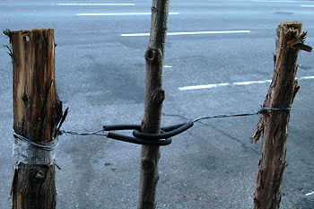
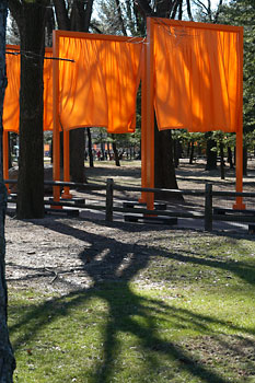
 The
Gates are a big deal here. I finally saw them for the first
time on Friday. I was actually expecting to be underwhelmed after hearing
from a
couple of
friends, even though others were raving.
The
Gates are a big deal here. I finally saw them for the first
time on Friday. I was actually expecting to be underwhelmed after hearing
from a
couple of
friends, even though others were raving.
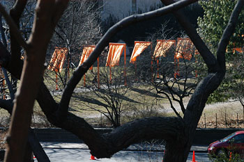
I approached from the South along Fifth Avenue around 5pm. As I reached the
fountain in front of the Plaza hotel, I got my first glimpse of the saffron
colored
fabric. My expectations were unfounded. Immediately, the enormity of the installation
began to sink in.
I think I understand why Christo and Jeanne-Claude chose
February: the color comes
alive
against
the
grays and
muted
greens of
the park
at this
time of year. At times, the moving fabric almost looks like flames, giving
a tangible example of the phrase ‘a blaze of color.’
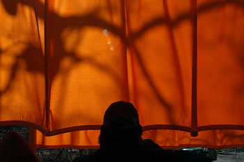
My first encounter with the Gates was actually quite frigid. After an hour in the park, my fingers
were getting stiff and I had to warm my hands. I'm certain I gave myself
a mild case of frostbite; I still have a strange sensation in my left index
finger from it. The light was wonderful, though, so I couldn't bring myself
to stop shooting – even with the discomfort. I shot until the light was gone.
Supple, yet insufficient as my cashmere-lined leather gloves had been
during that first cold encounter with the gates, my iPod served me extremely
well. I tuned
out
the sound
of the
people around me, and listened instead to my own personal soundtrack, as I
framed and shot image after image. It was mostly jazz, blues, and R&B. Sometimes,
I hummed
or sang along to the music, not caring
who
might
overhear.
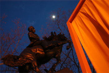
But there was a surprise waiting for me when I returned the next day: I already
thought the fluid motion of the draping had a certain visual music; without
headphones, I realized that the cloth had its own song. The gates sang and danced
for me.
Back to the first evening's shooting. I always lose some shots
around dusk, because I lose sight of how the shutter speed is
dropping off to compensate for the decreasing light. A few pictures blur from
camera
shake, and then I catch it. At that point, it's time either to increase the
ISO, or start using the monopod – I'm not in the habit of carrying
the full tripod that much.
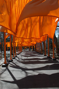
Fortunately, I'd made sufficient corrections to capture this last shot on
the first day:
From the first moment I walked the gates, I began to think about the meticulous
engineering involved, and the enormity of the project. Along the way, I saw
so many people photographing, filming,
and being
photographed. These people were not simply recording a spectacle, they were
making themselves a part of an event. The most fascinating aspect of this undertaking
that began in 1979 are the millions of conversations it has spawned, even among
people who will never experience it for themselves.
:::
More Art Pursuits
Remy Toledo gallery
is showing the photography of Mathieu Bernard. It's an intriguing modern take
on surrealism.
The Lucien Clergue exhibit at John
Stevenson gallery is a special treat. Vintage
museum prints are exhibited downstairs, while amazing color prints from in-camera
multiple exposures are presented on the upper level. A free CD catalogue is
available.
“These are not my Shoes” – Recent paintings by Antonio Petracca – is
a very interesting look at how Italians (and by extension, many other ‘outsider’ ethnic
groups) have been perceived in American culture. At Kim
Foster Gallery.
The fascinating and intense Pop Pluralism show at Jonathan
LeVine gallery marks
the relocation of Philadelphia's Tin Man Alley Gallery to Chelsea. The work
is sophisticated, complex, and dark.
:::
For people who work with text: T.F.M.
Bringhurst's The Elements of Typographic Style (version 2.5)
is both enlightening and entertaining. This book takes you way beyond simplistic
treatments of how to pour text or define typographic grids. It explores the mechanics
and architecture of text, placing it in a historical and practical context. If
you
want to do
more
than just pour text – if you want to design with confidence – your
copy of this book is likely to become well-worn and dog-eared.
Seasoned book typographers recite in their meditations not only the mantra
of points and picas – 12,24, 36, 48, 60, 72... – but also the mantra of octavo
signatures: 16, 32, 48, 64, 80, 96, 112, 128, 144, 160, 176, 192, 208, 224,
240, 256, 272, 288, 304, 320, 336, 352, 368, 384, 400... These are the lengths
of the books we read.
You can read about the birth of the comma on page 76, poorly-designed punctuation
marks on 76-77, and how the ampersand derived from the Latin word et (which
means and) on page 78.
On page 119, Mr Bringhurst explained how printing from moveable type was actually
invented in 11th century China, not 15th century Germany. It was Bí Sheng,
not Gutenberg. Moveable-type printing had even reached Korea by the mid 13th
century, but it wasn't a major success until Gutenberg, probably in large measure
because Chinese and Korean have immense collections of symbols compared to
the basic
alphabet of Latin and Germanic languages.
Earlier in the book, he points out that typesetting was one of the last crafts
to be mechanized, but one of the first to be computerized.
:::
A poster in the subway announces ‘Be a Bus Maintainer.’ The starting salary
for a 40-hour week is $23.8050/hr. It rises to $25.8375/hr. after four years.
Interesting that the salaries are calculated out to four decimal places. Looking
at the starting salary, that extra $.005 amounts to a whopping twenty cents
per week, and maybe $10 a year, compared to $23.80/hr.
When I was studying
chemistry in high school, I remember learning about paying to significant
figures when performing calculations. The idea was that when you multiplied several
numbers together, the number with the least decimal places dictated how many
decimal places were significant in the final result. That extra 20¢ certainly
doesn't seem significant.
I climbed onto a C train, and saw a young couple. She was carrying a shoulder
bag with an embroidered patch that read ‘Most People Suck.’ It still makes
me grin.
February 1, I'm in Starbucks again (feeding my habit). A guy with what appears
to be a roll of architectural drawings spies my camera, smiles, and says ‘That's
a real camera!?’ I smiled back, said ‘Yes, it's real. It's digital.’ His smile
withered. ‘Oh– it's digital?,’ he said. ‘Yes,’ I replied. He had nothing more
to say.